Must Design
75.6K views | +0 today
Follow
Must Design
Design Is Revolutionary
Your new post is loading...
Scooped by Martin (Marty) Smith
Scoop.it!

Make Web Designs Welcoming Don't Say Welcome via @Scenttrail [Before and After graphic]

Make Web Designs Welcoming Don't Say Welcome via @Scenttrail [Before and After graphic] | Must Design | Scoop.it

Working with a team at UNC Emergency Room trying to make their website more engaging. As the BEFORE (on the right) image shows their current site "talks to itself about itself". Ways to fix that include:

* Hero image that heeds the sight line rule.
* Clear Calls To Action.
* Move Social from bottom left to upper right.
* Prominent Join Our List subscription form.
* Curate Customer / Patient content in (coming soon).

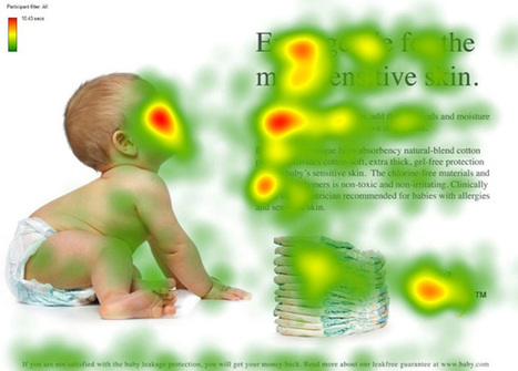
Your visitors' eyes follow the eyes of people in your photos. The image son the right show what NOT to do - make images that look like they are self referential. Never have people in an image on your site talking among themselves. Nothing says "we don't care about you" louder than images that are either too "smart", "exclusionary" or busy.

If people in your images don't look at the camera have their site lines pint to a Call To Action. Don't create ideas that are exclusionary either such as Leading, Teaching and Caring. That sounds like "selfspeak" to me.

OR, if you must have "selfspeak" then shore it with icons the way the UNC design lead did and use those icons to begin a conversation not a lecture about each of those ideas.

I LOVE text on a homepage for SEO, but it can be very exclusionary as the BEFORE image on the right proves. Tease the read with a few sentences and a "read more". BTW, the only time I use Read More CTAs is when I've teased something.

I prefer "learn more" since it feels more like we are learning together and less like work. Use closed loop CTAs when you are completing a proised action. All other times use CTAs that are more creative and fun.

The next step for this design, and the one that will make it really welcoming, is to curate in User Generated Content (UGC). When you include your customers (or patients in this case0=) you break down the THEM vs. US walls better than anything I can think of. Important to break down those walls since you need UGC and social shares to survive these days even if your have a .edu in your URL.

No comment yet.
Rescooped by Martin (Marty) Smith from AtDotCom Social media
Scoop.it!

Want To Make MILLIONS Online? Use Images Like This In Your Website Designs

Want To Make MILLIONS Online? Use Images Like This In Your Website Designs | Must Design | Scoop.it
They say a picture is worth a thousand words. True or not, images are an important part of any website we create. Since it is so easy to embed an image in a website (even the process of creating your

Via Robin Good, John van den Brink
Martin (Marty) Smith's insight:

Confessions of A Director of Ecommerce
I've spent the last few years trying to share as many "secrets" as I learned as a Director of Ecommerce. I don't run an ecommerce website anymore so can afford to be generous (lol). 

One of my pet peeves was directing the eye sight line of people in our images. I wanted the eyes pointed at something that mattered. People follow the eye line of those they are looking at. We had three tactics:

1. Gaze straight at visitor - promotes engagement.

2. Gaze directly at a Call To Action - promotes clicks.

3. Gaze at other people in same picture - promotes connection.


 We used #1 for pages with broad reach such as our homepage and category top-level pages. 

We used #2 in 4Q on the home page and bending the sight lines of any people in images on a product page works well (our product pages tended to make the PRODUCTS the heroes so few people). 

We used #3 when connection was one of the benefits of a product. If you sell wine, travel or family cars you may want to have pictures of people looking at each other. I would never ONLY have this picture on a webpage since it can make the viewer feel left out. 

The natural companion to the "connection" picture is a picture of a single person gazing out at the viewer. This says, "Yes, we see you, value your visit and want to be friends". 


Websites communicate SO MUCH in covert ways. Balancing what you say with one image such as the people looking at each other with another image to promote engagement is the game you play, the inside baseball "secrets" that separate teams capable of making millions in profits online from those who won't and wonder why :).M 


Robin Good's curator insight, March 6, 2013 5:40 AM


If you want to learn how to use images effectively inside your website or blog here is a truly excellent guide by Chistian Vasile on 1WD.


In the guide you will find rational and fact-supported advice on how to choose, place and test image use inside web-based content as well as lots of extremely relevant examples of effective image use online.


From the original article: "...if you manage to find the right pictures and insert them in the right places, they can do wonders for you, as they did for some others."


Well written. Informative. Resourceful. 8/10


Full guide: http://www.1stwebdesigner.com/design/images-on-web-design-usability-guide/


Peter Zalman's curator insight, March 10, 2013 8:06 AM

#cro